This project is not really needed or important, it is just something I want to do. So I saved it for a beautiful snowy saturday, when I am free of the usual work todos during the week.
What is p5.js?
Well, p5.js is a project I have been interested in and playing around with since many years. It is the kind of project that comes out when two beautiful worlds collide: coding and art. It is a very visual way of programming, where you can make algorithmic art, visualize data, make little games, all while being super simple to learn and with a vibrant community. It is a bit like in drawing, every project is called a “sketch” and usually you always see something. Here are many examples of the cool things you can do with it. And it is just a single p5.js file. Amazing 🤯.
It is so versatile and playful, I would like to have p5.js inside the toolbelt for this blog for the future. So whenever I want to visualize or animate something, or just have some fun, I can just pull it out and use it.
So here is what I set out to do:
p5.js implemented in minimal-paper theme, as a shortcode that can be called from within the markdown files. Multiple sketches should be able to run in a page, ideally in p5 global mode (normal coding like in the examples, no instances). The sketch files should be able to live in the bage bundles. And the sketch should elegantly be able to pick up site theme colors and the width of the parent content, to seamlessly adjust to the site style.
Developing
As a first step, I was discussing with ChatGPT how a good implementation in Hugo could look. There is a lot I find critical about LLMs, but the explorative use of going through options and learning about best practises is really a strength in my opinion. After some discussion, I started testing out a first approach: I downloaded p5.js and put it in the assets/js/ directory of my theme. I also created a p5.css in assets/css for future styling. I figured out the most elegant way would be to store the sketch inside the page bundle, e.g. as sketch.js and then call it via shortcode. Something like {{< p5 src="sketch.js" >}}.
Going through some options with ChatGPT, I quickly realized that if I want multiple sketches to coexist in a single page, I have think about how to isolate the sketches.
This is how a normal sketch is usually coded (called global mode):
function setup() {
  createCanvas(720, 400);
}

function draw() {
  circle(mouseX, mouseY, 20);
}
And here is how a sketch would look like, if you want it to co-exist with other sketches (called isolated or instanciated):
const sketch = (p) => {
  p.setup = () => {
    p.createCanvas(720, 400);
  };

  p.draw = () => {
    p.circle(p.mouseX, p.mouseY, 20);
  };
};

new p5(sketch);
As I significantly prefer the first option, I have to find another way to isolate the sketches. ChatGPT suggested to use iframes as a way of isolation. Iframes are like a box in a box, they put the content is an extra container that is isolated from the outside (which is the rest of my webiste). Inside an iframe, each sketch could live seperatedly and use the more elegant global mode of coding. I do not have enough experience to judge how good / bad it is to encapsule the sketches in iframes, but I gave it a try.
Some back and forth with ChatGPT and changing things myself lead to the following p5.html shortcode:
{{- $sketch := .Page.Resources.GetMatch (.Get "src") -}}
{{- $radius := .Get "radius" | default "12px" -}}
{{- $bgvar := .Get "bg" | default "--border" -}}


<div class="p5-wrapper" style="border-radius:{{ $radius }}; width:100%;">
  <iframe
    class="p5-frame"
    scrolling="no"
    style="border:0; border-radius:{{ $radius }}; width:100%; height:400px;"
    srcdoc='
<!DOCTYPE html>
<html>
<head>
    <meta charset="utf-8">
    <style>
        html, body {
            margin: 0;
            padding: 0;
            overflow: hidden;
            background: transparent;
        }

        canvas {
            display: block;
        }
    </style>
    <script src="/js/main.js"></script>
</head>

<body>
    <script>

        window.addEventListener("load", () => {
            // After iframe has loaded and sized, run the sketch
            {{ $sketch.Content | safeJS }}
        });

        const bgColor = getComputedStyle(parent.document.documentElement)
            .getPropertyValue("{{ $bgvar }}")
            .trim();

        window.__P5_BG__ = bgColor;

        {{ $sketch.Content | safeJS }}
    </script>
</body>
</html>'
  ></iframe>
</div>
With this, it needs a minimum of {{< p5 src="sketch.js" >}} to render a sketch. Let’s take the following code as a minimal example, that draws circles under the mouse (this is kind of the ‘hello world’ of p5).
// This function is run just once
function setup() {
  // Create a canvas that is 400px wide and 300px high
  createCanvas(400, 300);
  // Color the background with a light gray
  background(220);
}

// This function is run around 30 times a second
function draw() {
  // Every second, draw a circle with 20px diameter under your mouse
  circle(mouseX, mouseY, 20);
}
Here it is in action. Make sure to move your mouse or finger over it.
As you can see, it does not fill too well into the site design. Also, there is always one circle drawn in the top left corner. Lets fix this with a bit more elegant version of this sketch:
function setup() {
  // Create a canvas with the dimensions of the parent element (iframe)
  createCanvas(windowWidth, windowHeight);
  // Take the background color if present, otherwise 220 (light gray)
  background(window.__P5_BG__ || 220);

  // Set fill color to very transparent black
  fill(0, 0, 0, 30)
  // Remove stroke / borders
  noStroke();

  // Print text in the middle
  textSize(30);
  textAlign(CENTER);
  text('Move the mouse\n or touch screen', windowWidth / 2, windowHeight / 2);
}

function draw() {
  // Prevent circle to be drawn in top left corner on page load
  if (mouseX === 0 && mouseY === 0) return;

  // Draw circle under mouse
  circle(mouseX, mouseY, 20);
}
And here is the sketch in the site. Make sure to move over it with your mouse or finger.
The code is far from perfect and still has many issues, but the sketch looks already quite good and fits inside the page well. This is achieved on one side due to using windowWidth and windowHeight while creating. Here, the sketch picks up the dimensions of the iframe automatically and gets the right size.
Also, the shortcode is getting one of the theme colors (--border) and exposing it into the iframe as window.__P5_BG__. This way, the sketch can pick up always the current background color of the theme and style accordingly.
This prototype shows that is works well and this is a feasible way. In the next steps, I would like to make width and height properly configurable, allow centering for smaller sketches, have sensible defaults, expose all theme color variables to the sketch (but for this I need to define how many theme color variables I need) and so on. I also realized that I currently include p5.js inside the page header and it is always loaded when someone visits the site. Probably only few pages will actually make use of sketches, and I will also explore if I can only load it in those subpages.
To show if p5 is able to load more complex sketches, here is an example from the official website. Make sure to click / touch around!
Only load p5.js when needed
This was actually a matter of 2 minutes. I can actually just load p5.js directly in the head of the iframe. So instead of loading main.js like above, I do it like this:
 1<!-- Load p5 as an asset -->
 2{{ $p5 := resources.Get "js/p5.js" | resources.Fingerprint }}
 3
 4<!-- ... -->
 5<head>
 6    <meta charset="utf-8">
 7    <style>
 8      /* ... */
 9    </style>
10    <script src="{{ $p5.RelPermalink }}"></script>
11</head>
12<!-- ... -->
This way, it is only loaded if a sketch exists. Perfect! I do not know at this moment, if it is more elegant to put it in assets/js and load it like above or put it in static/js and load it conventionally, but I keep it like this for now.
Improving width and height variables
Height was also quite easy. With {{- $w := .Get "width" | default "100%" -}} I am able to get 100% width, except I explicitly say otherwise. The same goes for height: with {{- $h := .Get "height" | default "400px" -}} I have a default height, except I want something else. So with the following shortcode, I can have a sketch with custom dimensions:
{{< p5 src="sketch-v2.js" width="80%" height="300px" >}}
Which looks like this:
400px. I realized this is not smart (I guess in general), as it might look nice on desktops, but is too wide on phones and goes into the right margin. Therefore it makes more sense to use something like 80% to achieve the same, but make it safe across devices.
Centering sketches
You cannot see it anymore, but when developing this, the smaller sketches were on the left side of the content window and not centered. I think centering them would look more elegant. This also was very easy. I just had to add the following two lines in my p5.css file:
 1.p5-wrapper {
 2  overflow: hidden;
 3  box-shadow: 0 6px 20px rgba(0,0,0,0.08);
 4  margin: 1.5rem 0;
 5  margin-left: auto;
 6  margin-right: auto;
 7}
 8
 9.p5-frame {
10  display: block;
11}
I also improved some things of the sketch and added lines and scaled the circle size with the mouse speed:
It would be interesting to develop this from circles and lines into one line where the speed corresponds with the thickness. A bit like when using pens or drawing tablets.
Extra wide sketches
I think it would be absolutely magnificent if the sketches could be wider than the default content. So they take all the attention and leave a lot of space to visualize things. This is not strictly related with this projects dod, but I feel like I really want this. Also for pictures and other content. I have tried this some days ago with some ideas generated with ChatGPT, but I did not got it to work. I will try it again.
I will firstly try it with something that is simpler than a sketch in an iframe: a picture. So lets take the following picture as an example:

I included it with the following figure shortcode. It is nice, as it has the option to include css classes.
{{< figure
  src="/img/painting.jpg"
  alt="A beautiful painting of unknown origin"
  caption="A beautiful painting of unknown origin"
  class=""
>}}
This time, I want to try out a different ChatBot, so I asked Googles AI for help. I am still building best practises when it comes to AI use, but this early stage of exploring ideas and solutions is quite nice, as it takes much longer with traditional methods to get an overview of the possibilities.
Google gave me the following CSS snippets:
/* Expands the element to the full viewport width */
.full-width {
  width: 100vw;
  position: relative;
  left: 50%;
  right: 50%;
  margin-left: -50vw;
  margin-right: -50vw;
}

/* Optional: A wide version that is not full-width */
.wide {
  width: 120%;
  margin-left: -10%;
  max-width: 100vw;
}
Testing it out with the picture results in this wide version:
And this full-width version:
So this works quite well already!
Man this painting is magnificent, especially when given so much space. This is my kind of Utopia. A peaceful and beautiful world, a place built around nature, for social gatherings, where knowledge flows freely and you can learn from each other while walking through such gardens. To me, these two people look like a monk and a scholar, walking while having a discussion about some deeper topic. Ah, I really can fall in love with this painting alone. I dont know where I found it, I stumbled upon it once somewhere online.
A quick research revealed that this painting was done by the danish painter Carl Frederik Aagaard. To my delight, he has done multiple paintings in a very similar fashion, such as the following ones.
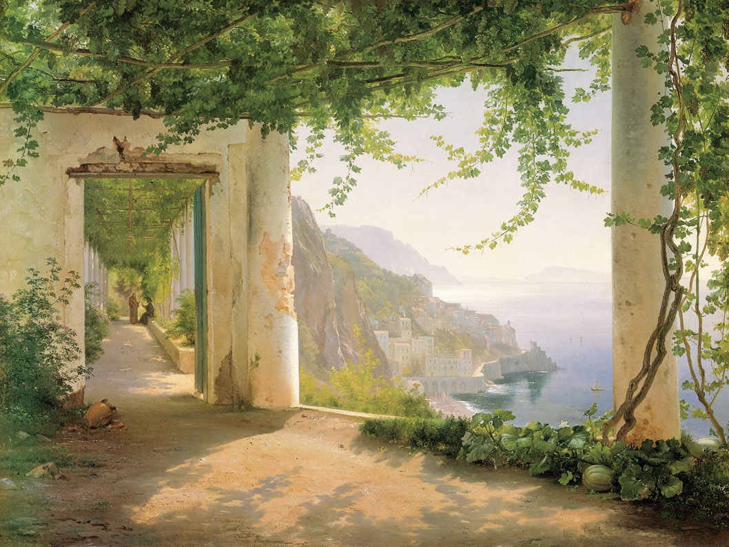
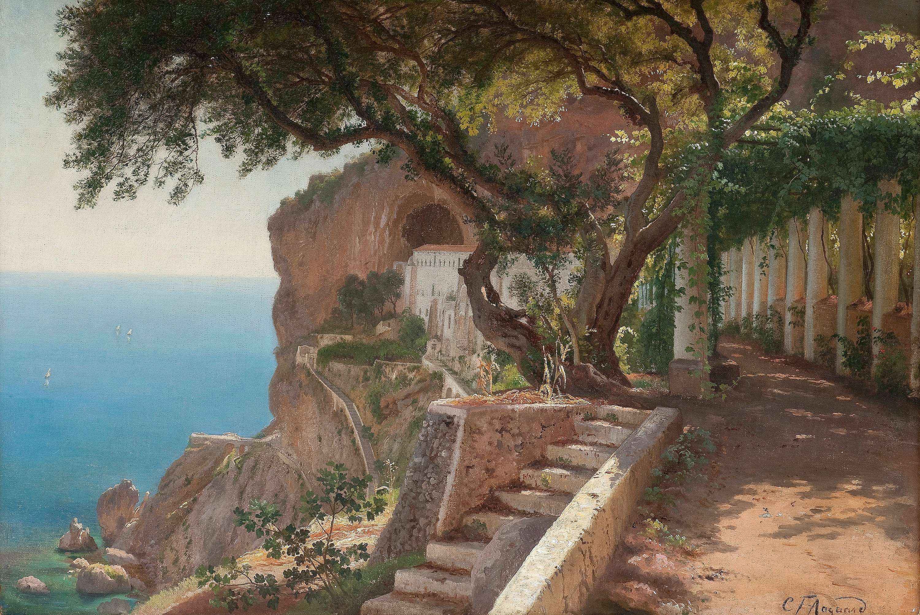
Especially the last one is almost exactly like the first. It almost looks like he drew a real place. Looking at the title of the last painting “Pergola in Amalfi”, I found out that Amalfi is a real place. When I checked it out in the 3D view of Google Maps, I can imagine that places as beautiful as this exist there. Maybe one day I can go there and get to explore.
But lets get back to the topic!
So it seems like the css classes are working with pictures. But there are still construction sites. When developing things for the web, one usual quick test to see your work fall apart is resizing your browser. Then you see how your content behaves under all circumstances, from small phones to gigantic screens. Web design is actually quite hard! Imagine you are tasked creating a beautiful powerpoint slide with nice colors, fonts, margins, layouts, etc. You know it will have text and pictures and various content. And you should design it in a way so it looks great on all slide sizes and orientations. Phew!
There are two issues with these two css classes wide and full-width. The wide one looks quite weird on small screens, as it has a strange margin on the right. And the full-width one still has rounded corners, which does not really fit when touching the screen edges. I will fix this in a moment.
Lets try out with a p5 sketch. Fast forward: After two hours of testing, tweaking and back and forth with Google AI I finally landed at a solution that I liked. Let’s take a look! Here is a wide sketch:
And here is a sketch with full-width. If you are on a desktop with a big screen, this can be quite impressive!
From a usage perspective, I solved it similarly to the figure shortcode with a class property, where I can specify which width class should apply. These classes will overwrite the width property of the shortcode, in case there is one. Here is the above example:
{{< p5 src="sketch-test.js" height="600px" class="full-width" >}}
It took a bit longer to get it working, as there are many things going on behind the scenes. It took me around 1h to get it running well on my desktop, but another multiple hours to get it beautiful on small screens and in all edge cases. As I chose iframes to isolate each sketch, it is a bit tricky from a css styling standpoint. Here is an overview of the structure to house a sketch:
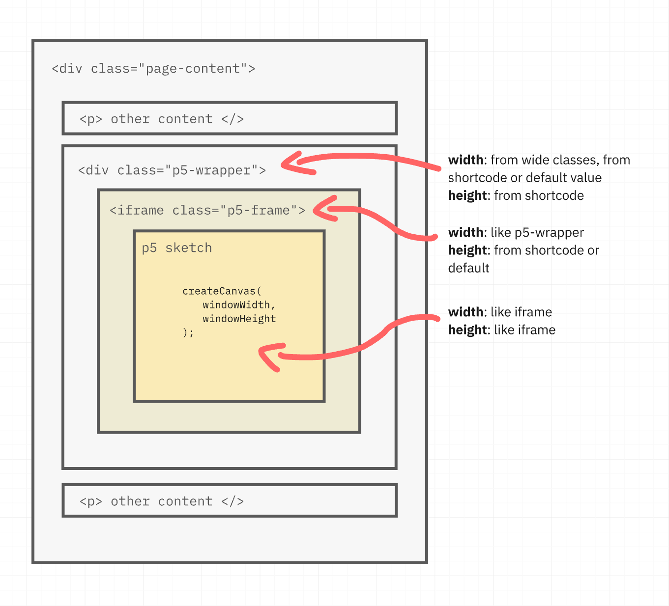
The sketch will always be initialized with createCanvas(windowWidth, windowHeight); and thus take the exact size of the iframe. The iframe will receive the height property in the shortcode or a sensible default, like 400px. When it comes to width, it will always be 100%, so taking the full width of its parent element, the p5-wrapper div. It sits in the same level as the other content of the page and this is the one where we will change the width! It’s width is determined through the following order: shortcode class property (e.g. class="full-width"), shortcode width property (e.g. width="80%") or the default value of 100%, which is the normal content width.
Here is the current version of the code, first the css. While I was at it, I added wide-120 until wide-180 to give different options, going from 120% content width until 200% respectively.
Here is the code for anyone interested:
CSS for images
/* All wide classes get this treatment */
[class*="wide"] {
  --wide-scale: 140%; /* Standardwert */
  width: min(var(--wide-scale), 100vw) !important;
  max-width: 100vw !important;
  margin-left: 50% !important;
  transform: translateX(-50%);
  position: relative;
}

/* Wide flavours update the variable */
.wide-120 { --wide-scale: 120%; }
.wide-140 { --wide-scale: 140%; }
.wide-160 { --wide-scale: 160%; }
.wide-180 { --wide-scale: 180%; }
.wide-200 { --wide-scale: 200%; }

/* When the content touches the edges, remove border radius */
[class*="wide"] img,
[class*="wide"] .p5-frame,
[class*="wide"] {
  border-radius: clamp(0px, (100vw - 100%) * 1000, var(--border-radius)) !important;
}


/* Full width is different */
.full-width {
  width: 100vw;
  position: relative;
  left: 50%;
  right: 50%;
  margin-left: -50vw;
  margin-right: -50vw;
  border-radius: 0 !important;
}

/* In cases of images that are inside some containers */
.full-width > img {
  border-radius: 0 !important;
}
CSS for the p5 sketches
.p5-wrapper {
  width: var(--p5-width, 100%);
  max-width: 100%;

  overflow: hidden;

  box-shadow: 0 6px 20px rgba(0,0,0,0.08);

  margin: 1rem 0;
  margin-left: auto;
  margin-right: auto;
  margin-block: 2rem;

  display: block;
}

/* iFrame */
.p5-frame {
  display: block;
  width: 100%;
  border: 0;
}

.p5-wrapper.full-width {
  width: 100vw !important;
  max-width: 100vw !important;

  position: relative;
  left: auto;
  right: auto;

  margin-left: calc(50% - 50vw) !important;
  margin-right: calc(50% - 50vw) !important;

  border-radius: 0 !important;
}

/* Wide classes  */
.p5-wrapper.wide,
.p5-wrapper[class*="wide-"] {
  --wide-scale: 140%;
  width: min(var(--wide-scale), 100vw) !important;
  max-width: 100vw !important;
  margin-left: 50% !important;
  transform: translateX(-50%);
  position: relative;
  left: 0;
}

.p5-wrapper.wide-120 { --wide-scale: 120%; }
.p5-wrapper.wide-140 { --wide-scale: 140%; }
.p5-wrapper.wide-160 { --wide-scale: 160%; }
.p5-wrapper.wide-180 { --wide-scale: 180%; }
.p5-wrapper.wide-200 { --wide-scale: 200%; }


.p5-wrapper.wide,
.p5-wrapper[class*="wide-"],
.p5-wrapper[class*="wide-"] .p5-frame,
.p5-wrapper.wide .p5-frame {
  border-radius: clamp(0px, (100vw - 100%) * 1000, var(--border-radius)) !important;
}
Shortcode for the p5 sketches
{{- $sketch := .Page.Resources.GetMatch (.Get "src") -}}
{{- $w := .Get "width" | default "100%" -}}
{{- $h := .Get "height" | default "400px" -}}
{{- $bgvar := .Get "bg" | default "--border" -}}
{{- $class := .Get "class" -}}
{{ $p5 := resources.Get "js/p5.js" | resources.Fingerprint }}


<div class="p5-wrapper {{ $class }}"
    style="--p5-width: {{ $w }}">
  <iframe
    class="p5-frame"
    scrolling="no"
    style="height:{{ $h }};"
    srcdoc='
<!DOCTYPE html>
<html>
<head>
    <meta charset="utf-8">
    <style>
        html, body {
            margin: 0;
            padding: 0;
            overflow: hidden;
            background: transparent;
        }

        canvas {
            display: block;
        }
    </style>
    <script src="{{ $p5.RelPermalink }}"></script>
</head>

<body>
    <script>

        const bgColor = getComputedStyle(parent.document.documentElement)
            .getPropertyValue("{{ $bgvar }}")
            .trim();

        window.__P5_BG__ = bgColor;

        {{ $sketch.Content | safeJS }}

        // Diese Funktion sorgt für das automatische Resizing im iFrame
        function windowResized() {
          resizeCanvas(windowWidth, windowHeight);
        }
    </script>
</body>
</html>'
  ></iframe>
</div>
I am quite happy with this. Yes, it took more than I thought (around 4-5h). But also yes, it was absolutely worth it. On this subject, I also developed a wide function for pictures, which I had planned anyway! So I am pleased :) Funny how other people would never do this kind of work, even with a decent pay, and I do it for free on a nice evening. Strange how brains can be.
Lets celebrate the ultra-wide sketches with a nice one that I did a while ago: Electric Grid. I saw some print material where a digital organization used the typical electric wires known from PCBs as a design. I was wondering if it would be possible to recreate this using p5. Some hours later, I ended up with something like this:
Make sure to click on the canvas to see it generating! Maybe some time in the future, I will also write about about this sketch, as there is actually a lot of interesting things going on under the hood.
Figuring out a color system
As the next step, I want to hand over the current theme colors to the p5 sketches, so they can use them to always color themselves fitting to the current theme of the page.
At this moment, I have colors as global CSS variables defined at the top of main.css:
:root {
  --bg: #ffcdb2;
  --text: #6d6875;
  --muted: #80786b;
  --border: #dab5a299;
  --accent: #b5838d;
  --muted-bg: #c9b3b3;
  --note: #bd9be1;
  --warn: #ec9d0b;
  --danger: #891010;
  --success: #258201;
  --medium: #e5989b;
}
They grew historically and do not follow one concrete system or idea. Now, when thinking about handing over theme colors to p5 sketches seems like a good idea to create a first conscious system of colors for this site and thus the minimal-paper theme. But I am a bit uncertain, how many colors does a theme need? Or how many color roles?
I did some research and at first, I did not find useful results and mostly just got palettes with concrete hex codes. At this stage I do not need a concrete theme, but I am rather looking for the different color categories or roles that each theme has. After speaking to a graphic designer I found out that the right keyword to search for was color system.
And a quick search showed good results! Here are two examples, Material Design and Shopify.
It is actually quite an interesting and big topic, and while searching, I found multiple other posts about the subject. Enough to create a whole new project and nerd myself into it, but I want to stay on track! So for now, I will just make an informed decision about some css color variables.
I like a lot the idea that the colors fulfill a role and their names describe this role. E.g. shopify’s surface or interactive roles are great, as they make it easy to understand. Also, as I have created callout boxes and tags, I definitevly want to keep roles such as info, warning, danger and success for those.
After some thinking, I ended up with this color system:
/* Mostly normal background and text */
--surface;
--on-surface;
--on-surface-muted;

/* cards, tables, info boxes, sketches */
--surface-variant;
--on-surface-variant;

/* borders, separators */
--outline;
--outline-variant;

/* Accents */
--primary;
--on-primary;
--secondary;
--on-secondary;

/* Code */
--code-surface;
--on-code-surface;

/* For callouts, tags and interactive elements */
--info
--on-info;
--warning;
--on-warning;
--danger;
--on-danger;
--success;
--on-success;
Is it cool? Yes ✅. Is it future proof? Yes ✅. Is it overkill? Absolutely ✅. But I like it :) And for anyone thinking, a theme would now have to have 21 different colors, this is not the case. These are 21 different roles, that - depending on the theme - are fulfilled by the same few colors. E.g. a minimalistic black / white blog might use this color system, but only use black, white and grey for everything.
I quickly adjusted the current theme to match these new categories and then created a little script that bridges the theme colors into the p5 iframe:
(function () {
    const styles = getComputedStyle(parent.document.documentElement);

    const theme = {
        /* Base surfaces */
        surface: styles.getPropertyValue("--surface").trim(),
        onSurface: styles.getPropertyValue("--on-surface").trim(),
        onSurfaceMuted: styles.getPropertyValue("--on-surface-muted").trim(),

        /* Variant surfaces (cards, sketches, etc.) */
        surfaceVariant: styles.getPropertyValue("--surface-variant").trim(),
        onSurfaceVariant: styles.getPropertyValue("--on-surface-variant").trim(),

        /* Outlines / separators */
        outline: styles.getPropertyValue("--outline").trim(),
        outlineVariant: styles.getPropertyValue("--outline-variant").trim(),

        /* Accents */
        primary: styles.getPropertyValue("--primary").trim(),
        onPrimary: styles.getPropertyValue("--on-primary").trim(),
        secondary: styles.getPropertyValue("--secondary").trim(),
        onSecondary: styles.getPropertyValue("--on-secondary").trim(),

        /* Code blocks */
        codeSurface: styles.getPropertyValue("--code-surface").trim(),
        onCodeSurface: styles.getPropertyValue("--on-code-surface").trim(),

        /* Semantic / callouts */
        info: styles.getPropertyValue("--info").trim(),
        onInfo: styles.getPropertyValue("--on-info").trim(),
        warning: styles.getPropertyValue("--warning").trim(),
        onWarning: styles.getPropertyValue("--on-warning").trim(),
        danger: styles.getPropertyValue("--danger").trim(),
        onDanger: styles.getPropertyValue("--on-danger").trim(),
        success: styles.getPropertyValue("--success").trim(),
        onSuccess: styles.getPropertyValue("--on-success").trim(),

        /* Shape / effects (non-color but very useful for sketches) */
        borderRadius: styles.getPropertyValue("--border-radius").trim(),
        boxShadow: styles.getPropertyValue("--box-shadow").trim(),
    };

    window.__THEME_COLOR_SYSTEM__ = theme;
})();
Inside the sketch, these colors can now be used the following way:
let theme = null;

function setup() {
  createCanvas(windowWidth, windowHeight);

  // Get the theme as an object
  theme = window.__THEME_COLOR_SYSTEM__;

  // Use the theme colors
  fill(theme.surfaceVariant);
  stroke(theme.onSurfaceVariant);
}
And that concludes handing over theme colors! And you know what? After checking, I realized it also concludes my definition of done for this project! 🎉
Summary
This took longer than I expected. But the reason was not really that it was more complicated, but because I wandered into multiple side-projects: Creating a solution for extra wide and full-width content, learning about Carl Frederik Aagaard and creating the (structure for) a coloring system. This is not something I regret :)
I really did enjoy working on this project, as it combines multiple things I really like. Hugo and p5 are excellent projects and to combine them was quite the nice task to do.
The best way I can imagine to present the fruits of this project is to dynamically display the nice color system I created in an extra wide sketch:
Although it might look like a picture, this sketch is generated when this page loads based on your screen width, takes all the current theme colors and displays them nicely, like in the pictures above of other color systems. This also means it will update the colors when I will change the theme of this page in the future. How cool 😎.
How it looked when I this project was done
As I expect to change the theme soon, here is how it looked when I finished this project:

Future Ideas
As always, there are still some future ideas I have for p5 sketches in Hugo:
- Check Performance. With multiple sketches I want to make sure they load and unload optimally. It seems like the browser loads them already only when close to the viewing window, but I would like to investigate this further.
- Not strictly a p5 thing: Currently small images set to
wideorfull-widthdo not scale up to fill the area, but stop when they end. This does not look great and I would like to fix it. - I would like to extend the p5 shortcode to control its styling, such as rounded corners, box-shadow and outlines.
- Add a button to toggle full screen for sketches
- Add an option for a caption to the shortcode
But now I am done with this project and it needs to be celebrated! 🎉
