Welcome to a new project on this blog, where I make out of small things big projects and deep rabbit holes! In today’s episode: Installing icons!
It all started with a simple idea: I thought it would be nice to indicate which links on this little page will send the reader away. Like a little icons that shows that this link now leads to a different page. I saw this on another nice little blog called Burgeonlab.com and liked the idea. Naturally, this lead me to losing myself in the rabbit hole of icon packs, svgs and Hugo partials and shortcodes. Welcome to the ride!
This project is simple: I am constantly tinkering on my theme and thinking of new things to add. Multiple times now, I thought that it would be great to have access to some icons, to brush up some parts of my theme. For example I am considering to include a little icon that indicates if a link is going external or not. Therefore I would like to have one or multiple icon packs in my theme minimal paper . The classic icon pack I know would be Font Awesome , but I would like to try something other options as well.
This is my goal:
Have icon pack support in my theme with the following criteria:
- Have at least one icon pack supported
- Have optionally more icon packs supported
- Serve the icon packs via the theme myself and not use some paid or freemium packs
- Use the most elegant and simple approach to include them in markdown and template files
The Search#
Lets get into searching. I find this process to be a bit messy and unsatisfying, as there are so many paid and freemium options and it is not always immediately obvious if they are good or not. Whenever there are too much options and I feel like in a jungle of options, I am looking for some crowd-sourced lists and rankings by similar minded people like me.
Looking at the relevant category on fmhy.net and the fitting Awesome Icons list on Github, I quickly got myself good options. Haha, I now just spent one hour looking at all the options and honestly, there are really a lot of good ones there! Here are the ones I liked the most:
- Nerd Fonts Icons - Nice because it combines multiple icon packs to a total of 10390!
- iconoir - Nice minimalistic style with 1671 icons
- ionicons - Very clean and professional style, but not so many
- Radix UI Icons - Very small crisp icons. I like it a lot, but not too many unfortunately
- Remixicons - Nice icons and 3200 of them, so a solid option
- Tabler Icons - With over 6000 icons and a very clean aestetic, I like this a lot as well
- css.gg - Very nice icons, but not so many
- Google Material Symbols - If you like Google’s material design system, this might be one of the best and most complete choices
- boxicons - Also quite nice icons and the free selections seems good
- lucide - Great resource with 1744 beautiful icons while writing
- streamline - This is not an icon pack, but actually the best resource I found that collects most free icon packs that I stumbled upon.
However all of them are quite similar in that they are minimal. After going out of my way to find icon packs / libraries that are not modern and minimal, I could only find those:
- Pixelarticons - Great library with around 800 free pixel art icons
- Pixeliconlibrary - 578 pixel icons that also look good
- Freehand by Steamline - Hand drawn icon set with 1000 free icons. Edit: The selection of the 1000 free icons is not really nice. Many essential or basic icons are not included.
- Rough.js - Not an icon pack but this library can take SVG as input and then make it look hand-drawn
Later edit: I found the one repo to rule them all!
https://github.com/iconify/icon-sets/
This project collects more than 200 open source icon packs into a single repo and streamlines their use. Or just use their collections.md as a well curated list of open source icon packs.
Implementation#
So let’s figure out how to get this icon pack working in my hugo theme. Instead of presenting the final results, I will walk you through the process. Because one might think including icons in your site is quite simple, but there were (as always it seems) more things to consider than I expected.
Downloading the icons#
First, I was a bit confused what the right approach was to get the icons. Of course I could just download them from the Github repo and move them to a proper folder, but somehow my computer science gut feeling tells me otherwise. They would be baked into the theme with no reference to which version number there is easy way to update. For now, I chose Pixelarticons to get started.
At this point I started figuring out a way to download the icon packs individually via npm. This approach however got outdated quite fast, as I found a better way. In case any one is interested, here is the old way:
First approach used to get the icon packs
Their main way to get the icons is using the node package manager, or npm. But as I am not using node or npm for my hugo blog, this also is not the straight forward solution. Also, the icons would live under /node_modules/pixelarticons/svg/ and I dont like this.
I had a short conversation with my AI chatbot of choice and figured out that using npm does not need to be a dealbreaker or rather can work for me. It will be done like the following:
- Download an icon pack using
npm install icon-pack, which installs it and potential dependencies - Put
node_moduleson.gitignore, so only thepackage.jsonfromnpmis tracked in the theme’s repo. - Move all desired icons from the
node_modulesdirectories to the theme directories manually - When the icons are updated in the future, it is just a matter of running
npm updateand moving icons again. - Users of the theme will never need to run npm install, this is just for someone developing the theme
Well, I looked into the iconify repo that I later found above and using this is the much better workflow to get my icons. So now follows the update with the new workflow 🙃.
Why change the workflow again? Two reasons: First, I have found that not all icon packs are at the same quality. For example, the Freehand icon set has hardcoded #000000 color in their icons, instead of using the much more sensible currentColor. This can be fixed with fill: currentColor !important; but is not ideal. On the other hand, packs like the Freehand pack is not available via npm, so I had to manually download and copy it into my theme repo. The iconify repo basically fixes both: It checks, cleans and updates all icons to be easy to work with and include e.g. the currentColor attribute. And also, as it unifies 200+ icon packs, it is a one top shop for all my potential icon needs. The only small catch is, that the icons are stored in JSON and need to be exported to SVG with a script.
Here is how I did this: In my theme, I created a subfolder tools/icon-export that contains everything about the icons. I initiated a new npm project and installed @iconify/json @iconify/utils @types/node tsx typescript. With some AI and the example scripts from the iconfiy website, I developed this script to extract icon packs.
The icon pack export script
import { mkdir, readFile, writeFile } from 'node:fs/promises';
import { parseArgs } from 'node:util';
import { iconToSVG, iconToHTML, parseIconSetAsync } from '@iconify/utils';
import { locate } from '@iconify/json';
import { PathLike } from 'node:fs';

// ============================================
// CLI argument parsing
// ============================================

const { values, positionals } = parseArgs({
  args: process.argv.slice(2),
  allowPositionals: true,
  options: {
    out: {
      type: 'string',
      short: 'o',
      default: '../../assets/icon',
    },
    height: {
      type: 'string',
      short: 'h',
      default: '1em',
    },
  },
});

const prefixes = positionals;
const target = values.out as string;
const height = values.height as string;

if (prefixes.length === 0) {
  console.error('Usage: tsx export.ts <pack1> [pack2] [pack3] ... [--out <dir>] [--height <value>]');
  console.error('Example: tsx export.ts mdi feather humbleicons --out ../../assets/icon');
  process.exit(1);
}

// ============================================
// Export logic
// ============================================

for (const prefix of prefixes) {
  let filename: PathLike;
  try {
    filename = locate(prefix);
  } catch (err) {
    console.error(`Skipping '${prefix}': could not locate icon set (${(err as Error).message})`);
    continue;
  }

  const iconSet = JSON.parse(await readFile(filename, 'utf8'));

  const outDir = `${target}/${prefix}`;
  try {
    await mkdir(outDir, { recursive: true });
  } catch {}

  let counter = 0;
  await parseIconSetAsync(iconSet, async (name, data) => {
    if (!data) return;

    const { attributes, body } = iconToSVG(data, { height });
    const svg = iconToHTML(body, attributes);

    await writeFile(`${outDir}/${name}.svg`, svg, 'utf8');
    counter++;
  });

  console.log(`Exported ${counter} icons from '${iconSet.info?.name || prefix}' → ${outDir}/`);
}
Then, it can be run using these commands:
npx tsx export.ts <pack1> [pack2] [pack3] ... [--out <dir>] [--height <value>]

# Examples
npx tsx export.ts humbleicons
npx tsx export.ts lucide
npx tsx export.ts feather gg --out ../../assets/mycustomfolder
Chosing the icon type#
Many icon packs offer their icons in different formats. When I look at an icon from tabler
for example, there are 11 ways to include it in my project, based on what I am using. For pixelarticons
there are two ways advertised. Excluding all the frameworks I do not use, there are still the options of svg, data URI, webfont or SCSS. As I want to use icons in my markdown files as content and in partials, I think the main question is, should I use svgs or a webfont?
While I am writing this, I am realising I actually chose svgs, but I did not really made this decision intentionally, but instead I just ran with my gut feeling that told me svg’s are the better choice. A quick research confirmed my gut feeling luckily. So SVGs it is!
Where should the files go?#
Hugo has multiple places where you can put resources like images, css, js or svgs. You can see a brief overview here
. My first intuition was to put the icons in theme-root/static/svg/, as I do not think they need any processing or touching and they can just be copied over to the public directory of Hugo.
But when I thought about it and researched a little, it seems smarter to use Hugo’s native way. This offers pipeline features like minify or fingerprinting later and users of the theme can simply overwrite single icons using their asset folder.
So in the end, I copied all icons from pixelarticons into theme/assets/icon/pixelarticons/.
How to load an SVG?#
How do you actually load an svg file? When looking at the content of one of the svg files from pixelarticons, it looks like this:
<svg xmlns="http://www.w3.org/2000/svg" width="24" height="24" fill="currentColor" viewBox="0 0 24 24">
  <path d="M4 20h16v2H4zm16-10h2v10h-2zM2 10h2v10H2zm2-2h2v2H4zm2-2h2v2H6zm2-2h2v2H8zm2-2h4v2h-4zm4 2h2v2h-2zm2 2h2v2h-2zm2 2h2v2h-2zM8 14h2v6H8zm2-2h4v2h-4zm4 2h2v6h-2z"/>
</svg>
Looks similar to HTML. I learnt that SVG is - similar to HTML - a markup language based on XML. But it uses different keys to describe the shapes and colors and thus is a different language than HTML.
So what is the right way to load this? Looking at the website of pixelarticons
they recommend to load svgs using the img tag:
<!-- HTML -->
<img src="pixelarticons/svg/external-link.svg" width="24" height="24" alt="External Link" />
But after some back an forth with an AI companion, I realized that this was not the only way to do this. And depending on your preferences also maybe not the best way. I did some research on the developer page from mozilla and they list basically two ways:
- Using the
<img>tags, aka. “the quick way” - Using the
<svg>tags, aka. “svg inline method”
The first one is simple, more familiar to loading pictures, but has less control. One downside is also that every icon will be a seperate network request fetching this file from the server. So if you would have many icons on one page, this could be a bit inefficient. Here is how it would look to load a svg via the img tag:
An example icon using the img tag: <img src="/svg/pixelarticons/home.svg" fill="white" width="24" height="24" alt="Home" />
And rendered: An example icon using the img tag: 
As you can see, the icon has a black fill color. Due to some technicalities of the img tag, we could not simply change this into any color we like but would have to use some CSS workarounds to change the styling of the icon.
On the other hand, there is loading SVGs via inline HTML. This is basically like copying and pasting the svg into the HTML file. This has more control for full styling, so I could easily change the color or other things about the SVG. On the other side, it makes the HTML file longer and less readable and it also prevents efficient caching of the graphics (as they are not seperate “images” anymore, but just part of the HTML text). Basically all graphics are coded into the HTML document.
Here is how that would look:
<!-- some HTML code -->

<span class="icon" style="color: white;">
  <svg xmlns="http://www.w3.org/2000/svg" width="24" height="24" fill="currentColor" viewBox="0 0 24 24">
    <path d="M4 20h16v2H4zm16-10h2v10h-2zM2 10h2v10H2zm2-2h2v2H4zm2-2h2v2H6zm2-2h2v2H8zm2-2h4v2h-4zm4 2h2v2h-2zm2 2h2v2h-2zm2 2h2v2h-2zM8 14h2v6H8zm2-2h4v2h-4zm4 2h2v6h-2z"/>
  </svg>
</span>

<!-- some HTML code -->
As you can see, this icon has the same color as the text (as of this writing, it is white color in my dark theme). This is because the fill of the SVG is set to currentColor. This is a keyword, where the svgs automatically take the color that is currently in use for the font and use it for their own styling. How convenient!
My preferred option is the second one. I have full control over the styling and - while the HTML code is less readable - as I work with Hugo and markdown files, this will be no issues for me. Also, Hugo will take care of all the heavy lifting of copying and pasting the svgs into the document, as we will see in the next segment.
How to implement it into Hugo?#
Okay, some time passed and I am happy to return to this little project. Outside it is raining, I got my coffee next to me, so this is perfect tinkering mood ☕! Let’s summarize: We found nice fonts, figured out a way to download them properly, chose to use SVGs over webfont, and decided that we want to load them inline. We also made some tests and they look good!
The next logical steps would now be to create the files to use the icons. But before we do this, lets remember again how Hugo works. I find Hugo a bit deceptive: It looks like a small and simple program at first, but actually a lot of things (can) happen under the hood. So this is my current understanding of the Hugo build pipeline:
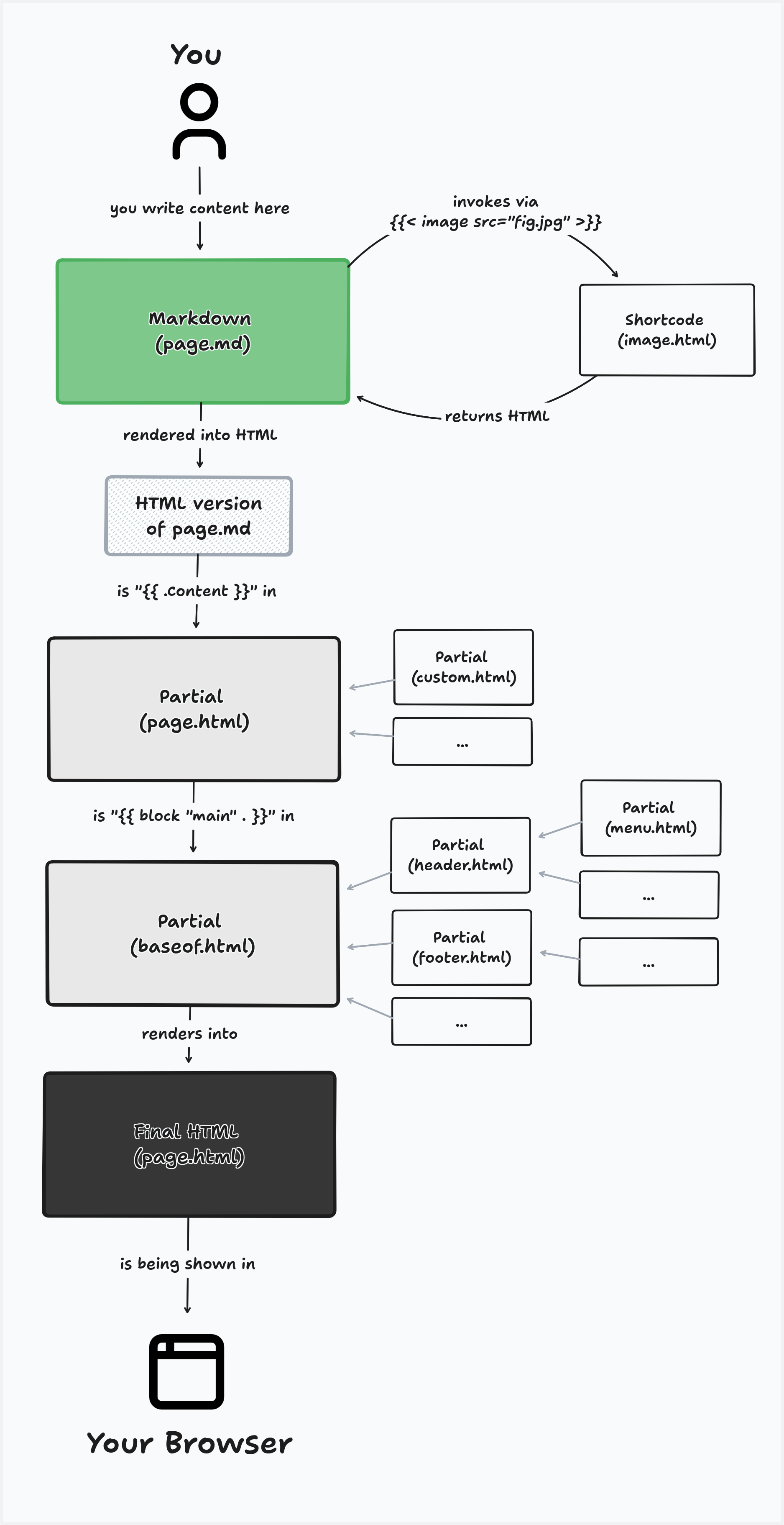
If you are new to Hugo, this might be a bit overwhelming. There would be a lot to say about how this works, but maybe for the purpose of this post it suffices to say: Your content lives in Markdown. Custom content that is not markdown can be included via shortcodes. And the rest of the site is being puzzled together using partials, which are reusable parts of your site.
The image is simplified and for example leaves out the difference between the files in your theme (e.g. a image.html partial for displaying images) vs files your site (an improved partial image.html).
Now, I want to use the icons both in my theme as well as directly in my content. As visible above in the image, I need to load icons both in shortcodes and in partials. I could write two seperate files that interact with my icons, but as I learned in my computer science classes, it is always wise to reduce redundant code. There is a better idea:
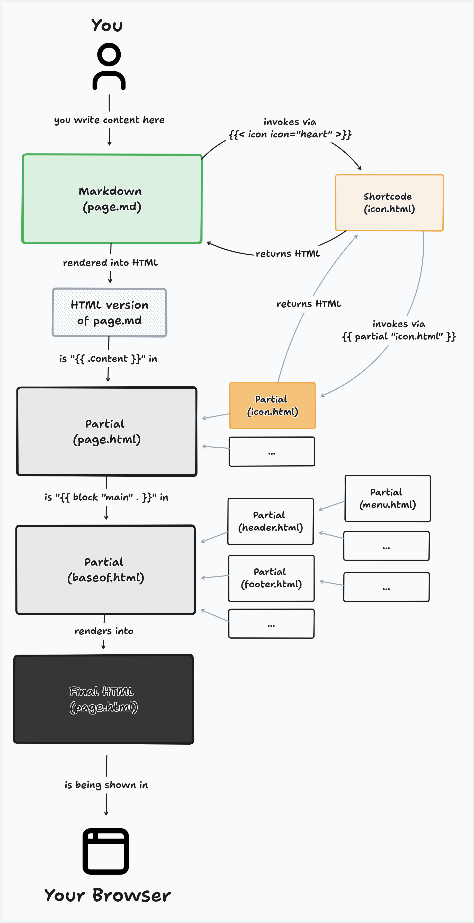
So the main logic to load an icon lives in the partial icon.html. This can be called from any partial of my site or my theme. But in case I want to use icons in the Markdown content, I have a shortcode icon.html, that invokes itself the partial. This is the best solution I know and keeps all the important logic in one place, while offering to load icons everythere.
Wild Icon Testing Corner#
This is a test:
Here is an inline icon of a person
and here as well from a different pack
.
The same here with a house
and here as well from a different pack
.
Here are bigger icons of houses
and
Error: icon 'non-existing-icon' not found in pack 'lucide' (/icon/lucide/non-existing-icon.svg)
Error: icon 'house' not found in pack 'not-existing-pack' (/icon/not-existing-pack/house.svg)
An icon with a different color:
Lorem ipsum dolor sit amet, consectetur adipiscing elit. Auctor justo cum consectetur sapien litora est dapibus erat parturient. Feugiat blandit quis pharetra et tempor egestas adipiscing ullamcorper justo . Laoreet a parturient suspendisse ante porta praesent per ligula torquent. Fusce magnis mollis tempus leo nunc porta placerat duis fusce. Sociosqu ultrices maecenas porta nunc id eu curae sagittis metus. Justo sem aliquam eleifend est purus nullam quam vel suscipit. Scelerisque lacinia elit in risus blandit luctus luctus urna sagittis.
Home Projects Getting icons
This page is protected
This page is protected
This is a feather by feather icons:
Writing Partial and Shortcode#
So after a lot of testing and playing around, I landed on this partial to load my SVGs:
<!-- located in layouts/_partials/icon.html-->

{{/*  partial to load svg icons in minimal-paper */}}

{{- $name := .name -}}
{{- $pack := .pack | default site.Params.iconPackDefault | default "lucide" -}}
{{- $class := .class | default "" -}}

{{- $path := printf "/icon/%s/%s.svg" $pack $name -}}
{{- $svg := resources.Get $path -}}
{{- $errMsg := "" }}

{{- if not $svg -}}
  {{- if hugo.IsProduction -}}
    {{- errorf "icon partial: could not find '%s' in pack '%s' (%s)" $name $pack $path -}}
  {{- end -}}
  {{- $errMsg = printf "Error: icon '%s' not found in pack '%s' (%s)" $name $pack $path -}}
  {{- $path = "/icon/icon-not-found.svg" -}}
  {{- $svg = resources.Get $path -}}
{{- end -}}

<span class="icon icon-{{ $pack }} {{ $class }}"{{ with .size }} style="--icon-size: {{ . }}"{{ end }} aria-hidden="true">
  {{- with $svg -}}
    {{- .Content | safeHTML -}}
  {{- end -}}
</span>

{{- with $errMsg }}
<span class="icon-error" role="alert">{{ . }}</span>
{{- end -}}
It has the following parameters:
name  # name of the icon file
pack  # name of the icon pack, defaults to site.Params.iconPackDefault or lucide
class # a list of classes can be provided for css styling
size  # if a specific size is required, it can be configured directly, e.g. 20px or 2em
This partial has more behind than one might immediately think. Here are a couple of the things that I took care to implement:
- Proper error throwing. Based on development or production an error will fail loudly or silently and print the icon path.
- There is a list of classes to quickly change the size (
icon-sm,icon-xl, etc.) or to change the color based on the theme (icon-danger,icon-primary). - An icon is styled on many levels with cascading priority. Here is the list from general to specific: Global defaults set in the
icons.css, default size and color per data-theme inmain.css, per-icon-pack css rules set inicons.css, using icon styling utility classes using theclassparameter, using thesizeparameter to change the size.
As hinted above, the shortcode is quite simple and just invokes the partial:
<!-- located in layouts/shortcodes/i.html -->

{{/* Delegate icon content to the partial */}}

{{ partial "icon.html" (dict
  "name" (.Get "name" | default (.Get 0))
  "pack" (.Get "pack" | default (.Get 1))
  "class" (.Get "class" | default (.Get 2))
  "size" (.Get "size" | default (.Get 3))
) }}
This shortcode can be used either named or positional . Here are some examples:
{{< i feather >}}  <!-- positional notation, defaulting to default icon pack -->
{{< i name="feather" >}}  <!-- named notation, defaulting to default icon pack -->

<!-- positional notation -->
{{< i home humbleicons "icon-primary icon-xl" >}}
<!-- named notation -->
{{< i name="home" pack="humbleicons" class="icon-primary icon-xl" >}}
It also needed some css tweaks, in case you are interested in this (but they are still to be finetuned):
CSS used so far
/* Default icon size for all */
.icon {
  --icon-size: var(--icon-size-default, 1.2em);
  width: var(--icon-size);
  height: var(--icon-size);

  display: inline-block;

  /* per default, center the icons to the line middle */
  vertical-align: var(--icon-vertical-align, middle);

  color: var(--icon-color-default, currentColor);
}

.icon svg {
  width: 100%;
  height: 100%;
  display: block;
}

/* Icon styling per icon pack */
.icon-pixelarticons {
  --icon-size: var(--icon-size-default, 1.2em);
  --icon-vertical-align: -15%;
  image-rendering: pixelated;
}

.icon-lucide {
  /* Default icon size for lucide, if not specified in theme flavour */
  --icon-size: var(--icon-size-default, 1.3em);
  --icon-vertical-align: -15%;
}

.icon-humbleicons {
  /* Default icon size for lucide, if not specified in theme flavour */
  --icon-size: var(--icon-size-default, 1.2em);
  --icon-vertical-align: -15%;
}


/* Icon utility classes */
.icon-primary   { color: var(--primary); }
.icon-secondary { color: var(--secondary); }
.icon-text      { color: currentColor; }
.icon-muted     { color: var(--on-surface-muted); }
.icon-info      { color: var(--on-info); }
.icon-warning   { color: var(--on-warning); }
.icon-danger    { color: var(--on-danger); }
.icon-success   { color: var(--on-success); }

/* Icon size utilities — higher specificity than .icon-<pack>
   defaults (two classes vs one), so these reliably win */
.icon.icon-xs { --icon-size: 0.75em; --icon-vertical-align: -3%; }
.icon.icon-sm { --icon-size: 1em; --icon-vertical-align: -10%; }
.icon.icon-nm { --icon-size: var(--icon-size-default); --icon-vertical-align: -15%; }
.icon.icon-md { --icon-size: 1.5em; --icon-vertical-align: -25%; }
.icon.icon-lg { --icon-size: 2em; --icon-vertical-align: -40%; }
.icon.icon-xl { --icon-size: 3em; --icon-vertical-align: -60% }
I wanted to find the most elegant way to use icons in Markdown and I am pretty happy with {{< i icon-name >}}!
Showcase#
So let’s have some fun with this. This paragraph will include the now standard pack of Lucide icons . Did you know Lucide has no icon for icons? Or for its spiral logo? It does however have a shell or snail or lollipop . What are the weirdest or most interesting icons I can find in Lucide? A microscope is nice, the QR-Code is cute . The calculator looks a bit like the or without windows like a smartphone . Someone must have forgotten a cog in someones brain . What will I have for lunch today ? I should play some Portal again (this icon is called Aperture). I think Lucide looks nice and minimal and digital, but also not so exciting.
Let’s try some Pixelarticons, but let’s make them big and with all the colors:
icon-primary
icon-secondary
icon-muted
icon-info
icon-warning
icon-danger
icon-success
This is how it looks, when the icons do not load in development:
Error: icon 'non-existing-icon' not found in pack 'lucide' (/icon/lucide/non-existing-icon.svg)
Error: icon 'house' not found in pack 'not-existing-pack' (/icon/not-existing-pack/house.svg)
Here are some Humbleicons, which are more minimal and simple:
Here are some icons from css.gg, which are also quite minimal and simple:
Here are some server icons that have the text color . Maybe in the future you will be wondering why I put this, but in the current theme, most icons here are in the primary color. But who knows when I will change this ;)
Here are all the different icons sizes:
icon-xs
icon-sm
icon-nm
icon-md
icon-lg
icon-xl
Summary#
This was a nice project :) As usual, I set myself high standards and take every detour and rabbit hole. But when I finish it, it is nice I have to say. The natural steps are the following:
- Document the icon use in the theme docs once they are fully matured
- Implement some icons in the theme
- Test out to run some icons through Rough.js or perfect-freehand to create a drawn look
But I am quite happy and can celebrate for pushing another little project over the finish line :)

P.S.: As you can see above, I implemented the little external link icon that shows when a link takes you away from this page :)